Visa Product Design System
Designing a documentation experience that makes accessibility guidance actually usable.
Context
Making accessibility guidance discoverable by design.
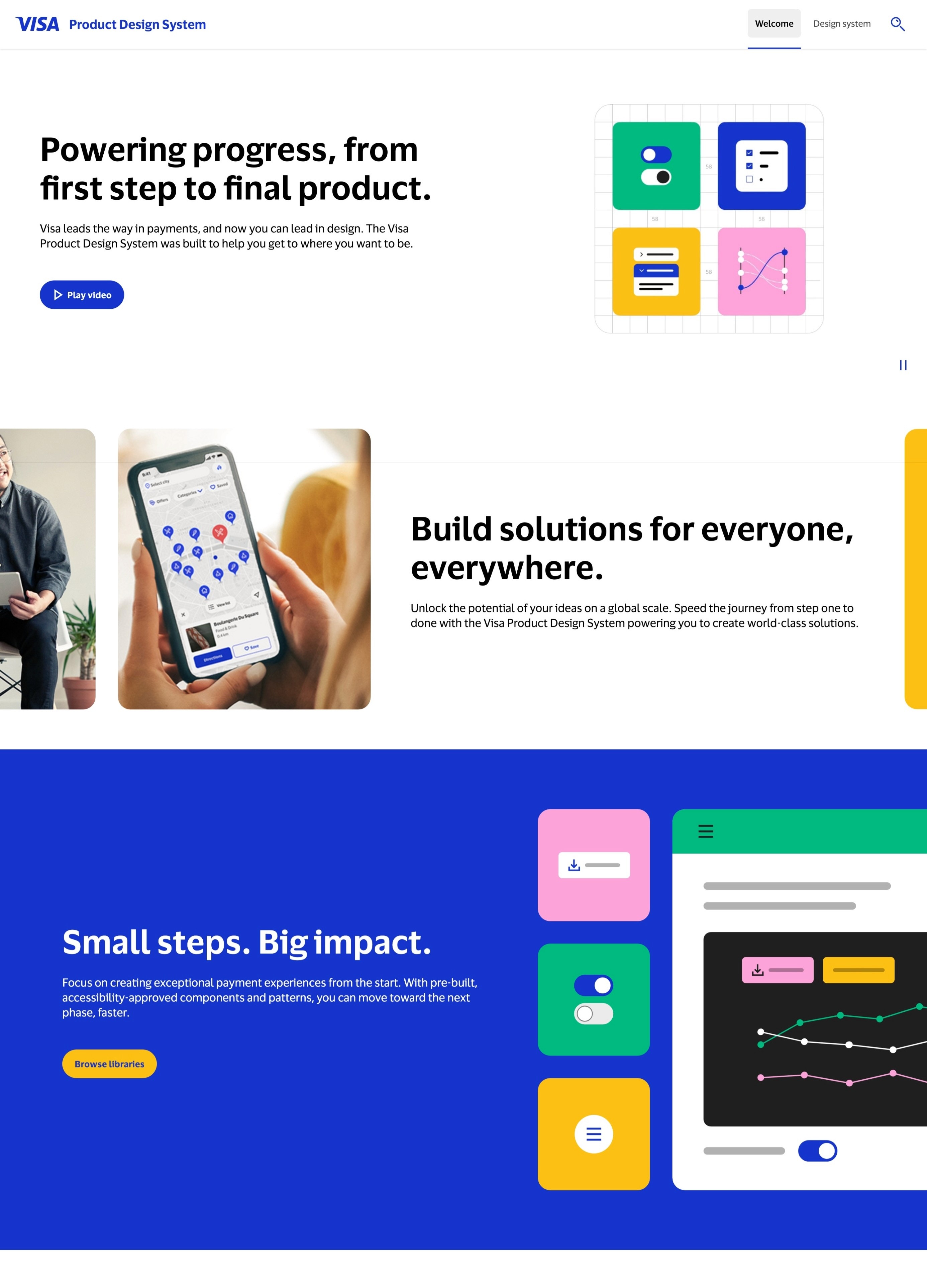
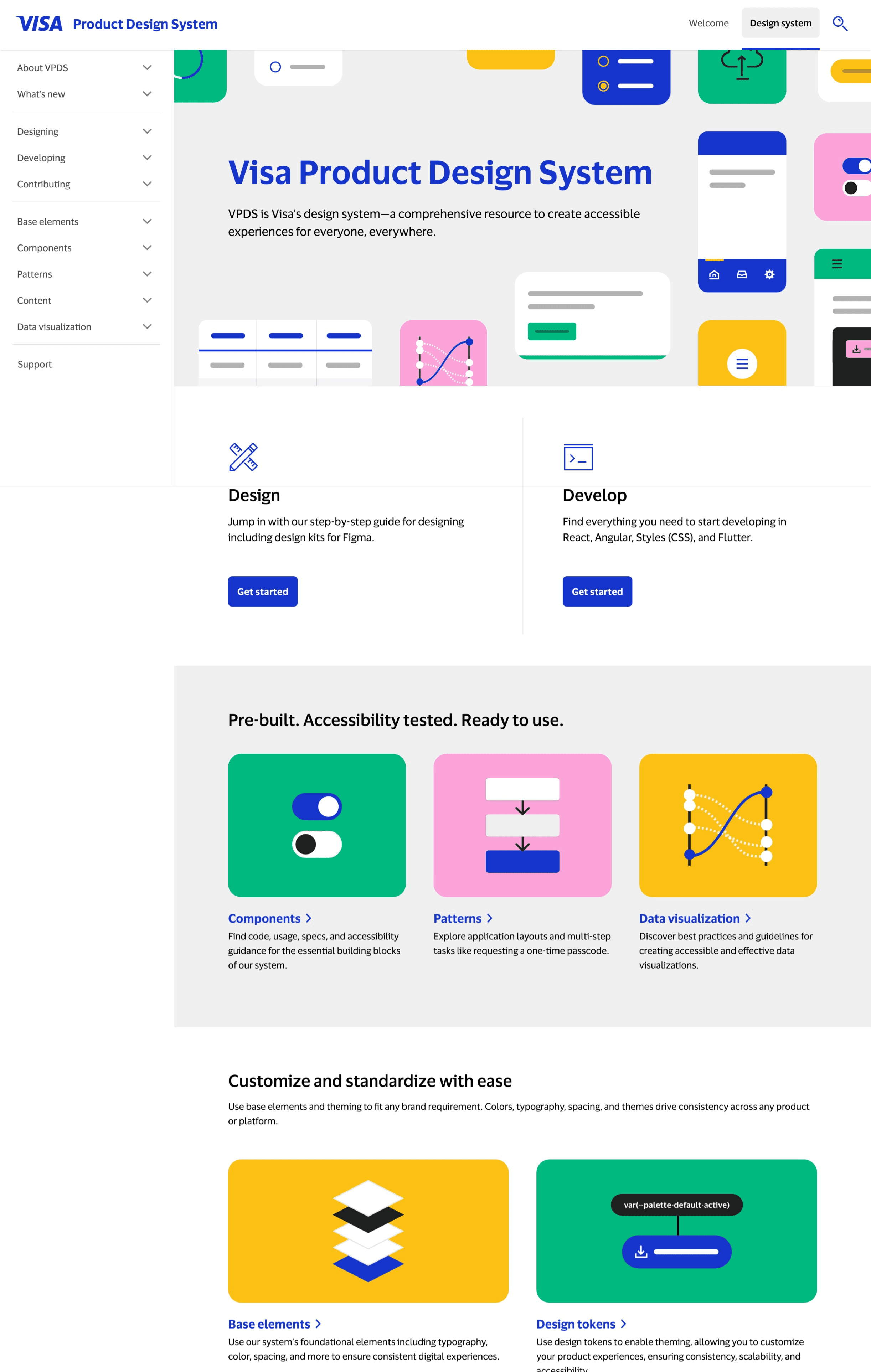
The Visa Product Design Systems (VPDS) is a comprehensive resource that enables teams to create accessible experiences for everyone, everywhere. As the team prepared for a public launch in April 2025, the challenge wasn't just ensuring the site met accessibility standards; it was ensuring that documentation itself was designed in a way that made accessibility guidance easy to find, understand, and act on.
I joined as an Accessibility Design Research embedded within the Design System team, where my focus was on auditing the existing site experience and using research insights to inform how we restructured and redesigned the documentation.
Accessibility Design Researcher
Accessibility, Design System, Engineering
Jan 2025 - Aug 2025 (7 months)
Figma, Fable, Accessibility Insights, VoiceOver, ANDI
The Problem
Accessibility guidance existed. Finding and using it didn't.
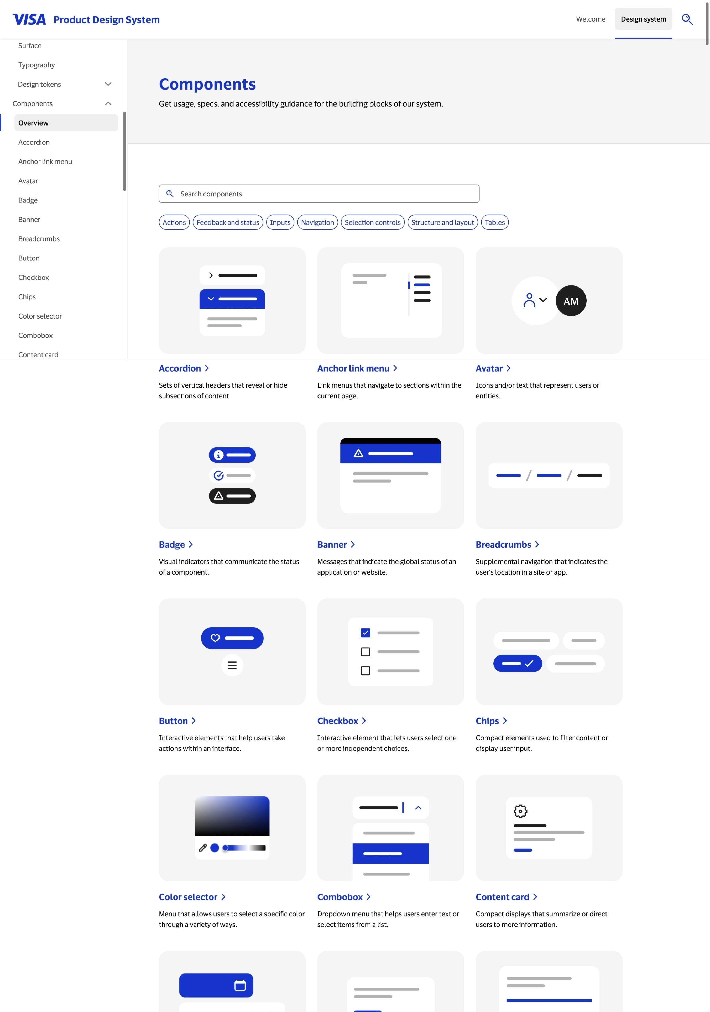
VPDS had robust accessibility content, but it was buried and disconnected from the components it referenced. For internal teams and external partners alike, the documentation wasn't working as a practical design tool – it was working as a compliance archive.
Challenge
How do we restructure the VPDS documentation so accessibility guidance is embedded where designers and engineers actually need it, not siloed away?
Process
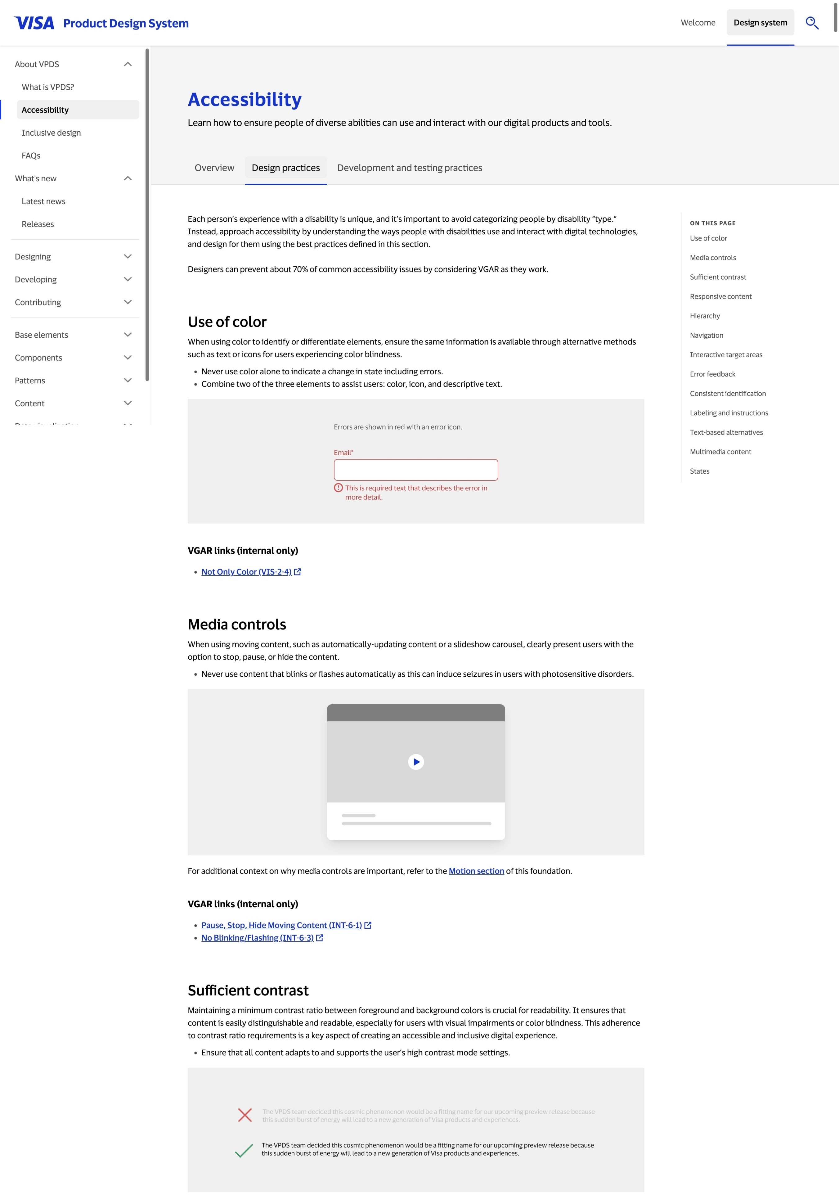
Auditing the existing experience.
Before redesigning anything, I needed to understand where the documentation was failing. I conducted an accessibility and usability audit across ~130 ages, using both automated tools and manual review. This wasn't just a compliance pass. I was mapping where guidance was hard to locate, where structure created confusion, and where content was written for auditors rather than designers.
This audit surfaced 50+ issues, and I categorized them not just by technical severity, but by design impact: which issues were causing users to fail their actual tasks?
Research with real users.
To validate my audit findings and uncover gaps no tools could catch, I ran usability sessions with 10 external participants with disabilities, including screen reader users, screen magnification users, and alternative navigation users.
The research questions were design-focused: Where do users get lost? What do they expect to find, and where? What makes a piece of documentation actually useful in a design workflow?
Key insights: Users weren't struggling because the accessibility information was wrong, they were struggling because the information architecture assumed they already knew what they were looking for. Navigation labels were too technical, component guidance was fragmented across multiple pages, and there was no clear entry point for "I'm a designer starting from scratch."
Redesigning the documentation structure.
Using research findings, I worked with the design system team to restructure the documentation layout and navigation. This included:
Reorganizing the IA so accessibility guidance appeared inline with components, rather than as a separate section users had to seek out.
Rewriting content hierarchy on key pages so the most actionable guidance led, with technical specs secondary.
Improving navigation labels to use languages that matched how designers and engineers actually talk about their work.
Establishing a documentation template that could be applied consistently across all component pages going forward.
Impact
Improving accessibility across the system and the organization.
Resolved 50+ accessibility issues across ~130 pages prior to public launch.
Redesigned documentation structure improved discoverability of accessibility guidance across the site.
Documentation template adopted by the Design System team as the standard for all future component pages.
Established an accessibility QA framework embedded into the team's ongoing release process.
Since launch in April 2025, VPDS has grown to 32,000+ active users, reflecting strong adoption and trust across teams.
Key Learnings
Good information architecture is an accessibility tool.
The biggest usability gaps weren't technical, they were structural. Where information lives, what it's called, and how it's sequenced determines whether guidance gets used or ignored.
Research reveals design problems, not just user problems.
Running sessions with assistive technology users surfaced issues with our content strategy and documentation design that automated audits couldn't touch. The findings directly shaped design decisions.
Embedding accessibility into the design process scales it.
By building a repeatable documentation template and QA framework, we turned accessibility from a launch checklist into a living part of how the team designs and ships.